
-
Proper use of Infographics Tutorial
An infographic (information graphic) is a representation of information in a graphic format designed to make the data easily understandable immediately. People use infographics to quickly communicate a message, to simplify the presentation of data.
To make sure the infographic is accessible per ADA guidelines, you must also present the same content in a way that users that are visually impaired can access it.Example of an Infographic (Not ADA Compliant)

This infographic is located on many of the school sites within the district. And while it provides especially useful information, it is not ADA compliant. As you can see, it provides a lot of textual content, but it is in the form of an image. Screen readers only read the “Alt Text” provided with the image which is not going to cover this amount of information.
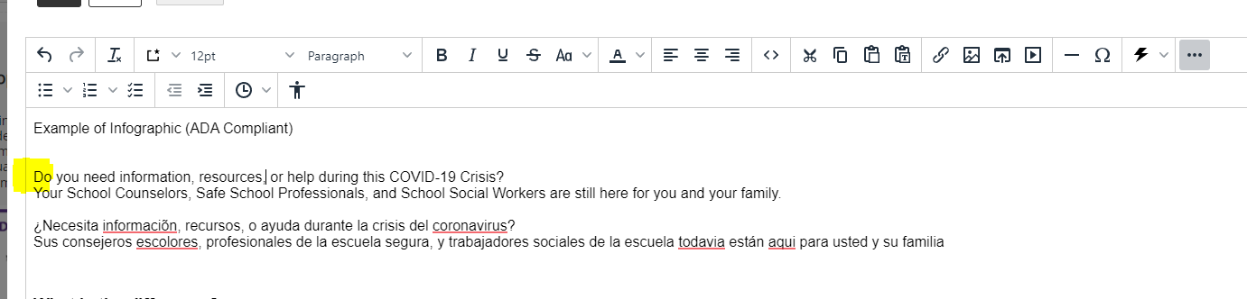
Example of Infographic (ADA Compliant)
Do you need information, resources or help during this COVID-19 Crisis?
Your School Counselors, Safe School Professionals, and School Social Workers are still here for you and your family
¿Necesita informaciõn, recursos, o ayuda durante la crisis del coronavirus?
Sus consejeros escolores, profesionales de la escuela segura, y trabajadores sociales de la escuela todavia están aqui para usted y su familiaWhat is the difference?
There is no difference in the image other than changing the size to better fit the page. The only thing that has changed is the textual content from the image has been provided in an alternative format for screen readers and those with impaired vision. It is also especially important to make sure the Alt Text (Alternative Text) for the image is correct. The proper alt text for this image would be something like “School Counseling Information about Covid-19".
Many schools have this image located somewhere on their site right now. It is important to make sure it is accessible to everyone.Detailed Instructions
These instructions will show you how to add the example above to your site. Replace the content and images with your own.
- Make sure to upload the image into your files and folders section. What folder or subfolder you upload it to is your decision. Remember the location of where you uploaded the image.
- In the web content manager, open the page where you want to add (or replace) the infographic.
- Edit or add an app suitable for adding the content. In this situation, the content app will work for what we are trying to accomplish.
- Copy the text content from the example above.
- Paste the content into the app where you would like it to appear.
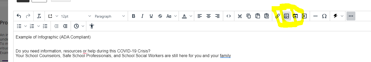
- Put your cursor in front of the D in the first line of text (“Do you need information...”).
- From the tool menu select the add image icon.
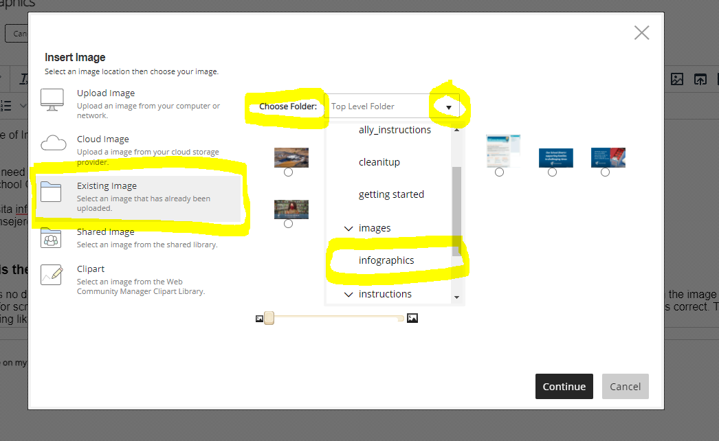
- Choose the existing image. Use the drop-down to find your images if you have placed it in a subfolder. Select your image. Click Continue.
- On the next screen, add a useful descriptive alternative text. For this graphic, I will use “Counseling Information and resources about COVID-19".
- In the height and width boxes, choose the width you want. It does not have to be big now that the same content is provided in textual form. For example, 150 to 200 pixels wide should work fine. Click your cursor inside the height field and the content manager will select the height, keeping the image proportions correct.
- In the alignment, dropdown select left. This will have the image line up with the text to the right.
- Put a 0 in the border field. The border field will always be zero.
- Putting a 10 in each of the Vertical Padding and Horizontal Padding fields will give you an invisible border around the image so the text does not run into it. This does not mean much for our example but is especially useful for photographs.
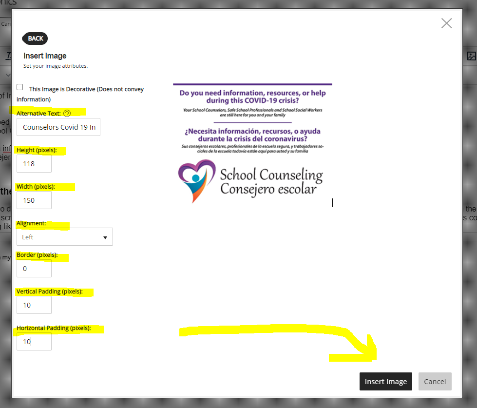
- Click on the insert image to insert the image into the page. If everything looks ok, click on the Save button to save your page.
Alternatives
There are multiple ways of doing something. Below is an alternative example of the infographic. It is no longer an infographic as all the useful information is in textual form and the graphic is just decorative and does not provide any information to the user.
 Do you need information, resources, or help during this COVID-19 Crisis?
Your School Counselors, Safe School Professionals, and School Social Workers are still here for you and your family.
¿Necesita informaciõn, recursos, o ayuda durante la crisis del coronavirus?
Sus consejeros escolores, profesionales de la escuela segura, y trabajadores sociales de la escuela todavia están aqui para usted y su familiaInfographics/Flyers Checklist
Text- The flyer/infographic consists of true (selectable) text and not an image of the text.
- The text is clear and easy to understand.
- The font and text size are adequate and make the content readable.
- Uppercase, bold, and italic are used sparingly.
- The language and tone in the written text is appropriate.
Structure
- The flyer/infographic has clear and descriptive text.
- Headings and subheadings are present to organize information into topics or categories.
- Bullet lists are present to organize related materials into key points.
- Numerical lists are preset to organize numerical processes.
- The reading order of the flyer/infographic accurately matches the visual order.
Color
- The colors or shades used in the flyer/infographic make the content readable.
- Color is not the only method used to distinguish or emphasize important text or links.
- There is a good color contrast between the foreground and the background content.
- There is a good color contrast between the text color and the background color.
Links
- The links in the flyer/infographic are easy to recognize and underlined.
- The link text is clear and accurately describes where the link will take the reader.
- All link text is unique unless the links lead the reader to the same page.
- Link phrases such as "click here" or "more" or "continue" are not used.
- Link focus indicators for keyboard users are easy to identify visually.
Images
- Images that convey important information have alternative text (alt-text).
- The alt text is brief and accurately describes the intent of the image.
- The alt text is 8 to 80 characters long.
- The alt text is not repetitive and does not use phrases such as "image of" or "graphic of".
- If the flyer/infographic is in an image format (JPEG, GIF, PNG., etc...), a transcript for the flyer/infographic is also available with all of the exact information in the image.
Mobile
- When the flyer/infographic is zoomed in, the content resizes appropriately.
- The content does not overlap when the flyer/infographic is zoomed in.
- Any links in the infographic are readable using a mobile device screen reader (Voiceover for IOS and Talkback for Android)